-
YELL EXTREME PARK BRANDING
Yell Extreme Park is the first extreme amusement park in Armenia, located in Yenokavan, Tavush marz. People visit here for Zipline, Paragliding, Horseback Riding, Rope Park, Off-Roading, Mountain Biking, Paintball and for having some extreme fun.
-
DELIVERABLES
CORPORATE IDENTITY
-
CLIENT
.jpg)
What connects people who love extreme, and people who absolutely hate it? Yelling is the common thing: someone yells of fear, the other yells of joy, adrenaline and the other yells of mixed feelings. While naming this park our intention was to convey these mixed feelings, break all the boundaries and create emotional bridge between the visitors and the park. So, this question and a quick zipline flight in the park inspired us to name this place “Yell Extreme Park”. In terms of brand visualization, as you see, the logo symbol in a form of a yelling mouth fits the name.
.jpg)
Corporate identity includes three main characters, young boys, who are imaginary visitors of the park. The first one is flying on a zipline, second one is on a mountain bike, and third one is on parachute. Although the illustrated characters look scared, shouting out, they are having lots of fun. These characters are inseparable parts of the brand and express the emotions one would expect to have when visiting Yell Extreme Park.
.jpg)
.jpg)
.jpg)
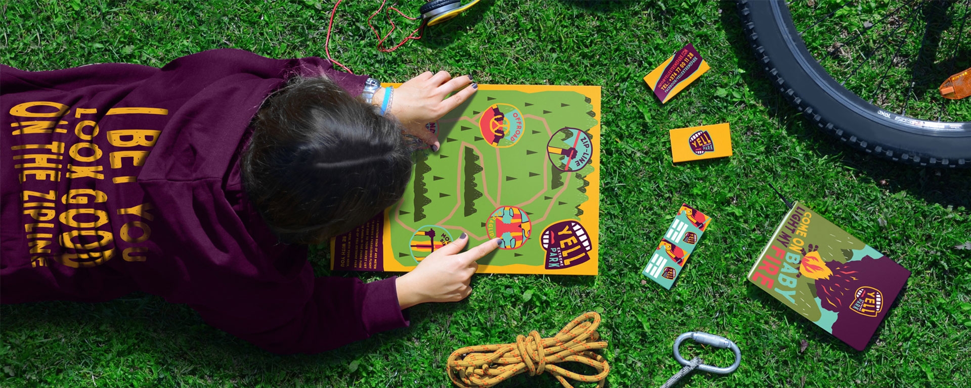
Bright colors and the funny logo symbol evoke warm, crazy emotions and desire to visit the place. For corporate identity we have chosen four main bright colors that are expressed in the nature. We have created different navigating and restriction signs as well as a park map, that are located in the amusement park. The map of the park or “Map of Bear Traces” points out the extreme activity locations.
.jpg)
.jpg)
.jpg)
.jpg)